Admin Dashboard Overview
Modified on Tue, May 6, 2025 at 8:20 AM
The Wellness360 Admin Dashboard provides a quick, comprehensive view of key wellness metrics and user engagement across your organization’s wellness program. From the dashboard, administrators can see activity levels, spending, risk scores, and more, all in one place.
Use below guide to familiarize yourself with each section of the dashboard and how it can help you monitor and manage your program effectively.
1. Log in to the Admin Portal
- Access your company’s Wellness360 Admin Portal.
- Enter your credentials and click Login.
2. Access the Dashboard
- Once logged in, you will land on the Dashboard page by default or can select "Dashboard" from the left-side navigation menu.
3. Dashboard Overview Cards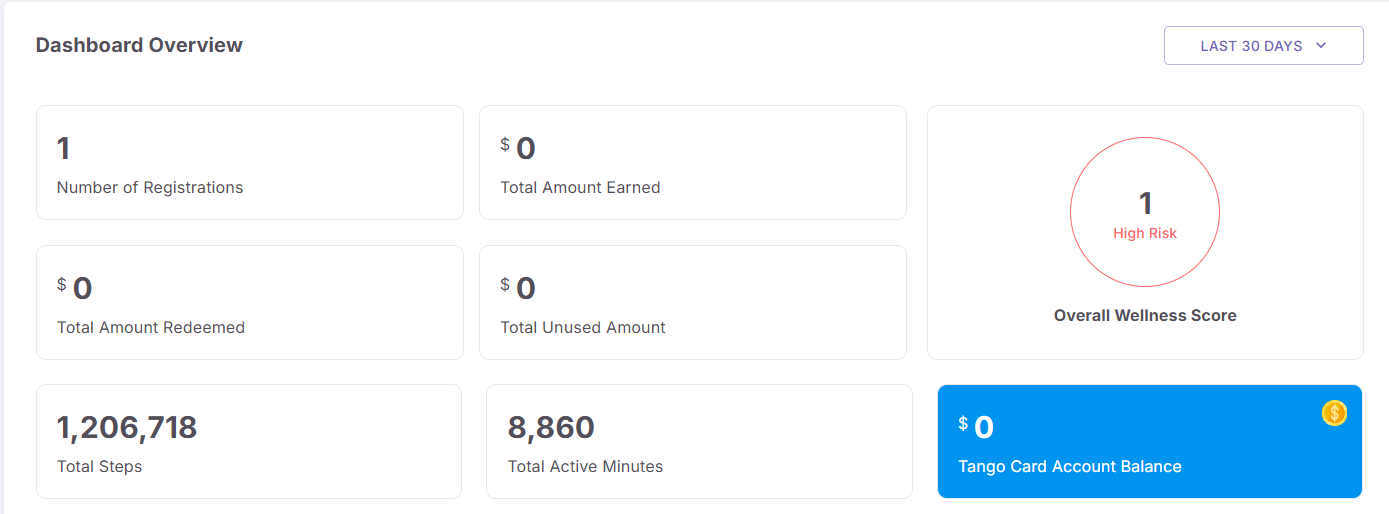
At the top of the dashboard, you’ll see a series of cards and key numbers summarizing important program metrics:
Number of Registered Users
- Displays how many users have registered within the selected time frame (e.g., Last 30 Days).
Total Amount Earned
- Shows the monetary rewards or points converted to a reward that users have earned so far.
Total Amount Redeemed
- Indicates how much of those rewards users have actually redeemed.
Total Unused Amount
- Reflects the difference between what’s earned and what’s redeemed—i.e., rewards that remain unclaimed by the users.
Overall Wellness Score
- Provides a wellness score for the employees in the company.
Total Steps
- Tracks the cumulative steps taken by all active users in all wellness programs.
Total Active Minutes
- Displays the total number of active minutes logged by users in different programs.
Tango Card Account Balance ($499)
- Shows the current balance in your rewards account (Tango Card).
- Use the time filter (e.g., “Last 30 Days”) at the top right to adjust the date range for all displayed metrics from last 30 days up-to last year
4. User Demographics & Login Statistics
Below the overview cards, you will see more detailed breakdowns and graphs:
Total Active Users by Gender
- A pie chart showing the gender distribution among active users (e.g., 32 Male, 30 Female, 38 Other).
Total Active Users by Age
- A bar graph showing how active users are distributed across various age ranges.
User Login Over Time
- A line graph that tracks how many users logged in each day over a specific period (e.g., Jan 01 to Jan 07).
- Helps you spot daily engagement peaks or dips.
Unique Login by Device Type
- A horizontal bar indicating how many users are logging in via Web, iOS, or Android devices.
- For example: Web (55), iOS (20), Android (25).
- Useful for understanding how users access the platform.
5. Leaderboard & Challenges
Further down the dashboard, you’ll find information on top-performing participants and popular challenges:
Leaderboard
- Displays the top-ranking users by points earned across all challenges
- This encourages healthy competition among participants.
Top 5 Challenges
- Lists the most popular or highest participation challenges, each with its completion percentage (e.g., 25%).
Top 5 Activities
- Similar to Challenges, this section highlights activities with highest completion percentage. Each activity has its corresponding percentage metric.
6. User Distribution by Level
- A line chart shows how users are distributed across different “levels” in the program
- For more information on levels, check How to create a reward campaign.
This chart can help administrators see if the user base is clustered at lower levels (newer participants) or higher levels (highly engaged users).
7. Managing and Updating Dashboard Data
- The data in the cards, charts, and graphs usually updates automatically based on user activity and engagement.
- If you want to re-filter data, use the drop-down date filter (e.g., “Last 30 Days”) to see respective statistics.
*If you are experiencing any issues, please contact the Wellness360 Team.
Was this article helpful?
That’s Great!
Thank you for your feedback
Sorry! We couldn't be helpful
Thank you for your feedback
Feedback sent
We appreciate your effort and will try to fix the article